 EarlyBird Help Center
icon
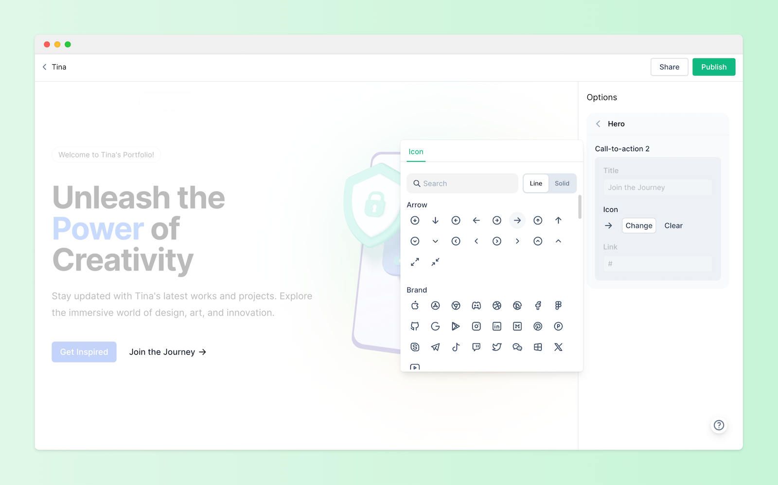
By assigning a icon type to a component, EarlyBird users can easily set up a range of SVG icons, including social network icons, button icons, and feature icons, etc.
We have included a selection of icons for you to choose from. You can find the default icon options at EarlyBird Icons.
👀 Didn't find an icon you want? Request it in our community.
Example
json
[
  {
    name: 'hero',
    title: 'Hero',
    fields: [
      {
        name: 'cta2',
        title: 'Call-to-action 2',
        type: 'object',
        fields: [
          {
            name: 'icon',
            title: 'Icon',
            type: 'icon',
            default: 'arrow-right-line'
          }
        ]
      }
    ]
  }
]
[
{
name: 'hero',
title: 'Hero',
fields: [
{
name: 'cta2',
title: 'Call-to-action 2',
type: 'object',
fields: [
{
name: 'icon',
title: 'Icon',
type: 'icon',
default: 'arrow-right-line'
}
]
}
]
}
]jsx
<div id="hero">
  <a
    href="#"
  >
    <span>Join the Journey</span>
    <Icon name={hero.cta2.icon} />
  </a>
</div><div id="hero">
<a
href="#"
>
<span>Join the Journey</span>
<Icon name={hero.cta2.icon} />
</a>
</div>Preview